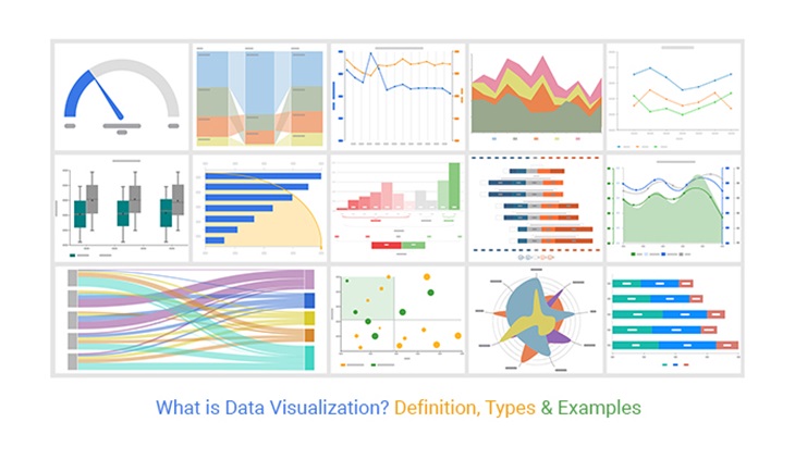
In the evolving world of data analytics, understanding data is all about how it’s presented. Effective data visualization can dramatically improve decision-making processes, ensuring the translation of complex data sets into easily digestible information. The histogram chart is extensively used in the analytics domain for data representation. Keep reading as this article unravels the secrets of creating effective and attractive histogram charts for data analytics.
Understanding the Importance of Histogram Charts in Data Analytics
Alt text: A person working on a computer at a desk looking at multiple screens utilizing data to create a histogram chart.
In the context of data analytics, a histogram chart is a critical tool for bridging the gap between raw data and meaningful insights. It acts as a visual representation of data distribution over a continuous or a certain period. Histograms help to identify patterns and trends that are not easily identified in tables or raw data.
Histograms visually represent data variation, central tendency, and skewness. Their ability to provide a quick overview of the distribution of a dataset makes them a favorable choice in data analytics.
In essence, these visual tools effectively summarize large data sets and are instrumental in presenting data in a readable and understandable form. Consequently, they democratize access to data findings, allowing different stakeholders with varying levels of data proficiency to make informed decisions.
Key Elements for Designing Attractive Histogram Charts
The attractiveness of a histogram chart significantly influences its effectiveness. Clear, aesthetic histogram designs entice the viewer’s attention, facilitating easier data absorption.
When designing histogram charts, critical elements include color, resolution, arrangement, and title annotation. These not only enhance the attractiveness of the chart but also foster the simplicity of the graphical illustration.
Avoid clutter; striving for balance and proportion when designing a histogram chart is also fundamental. Including unnecessary graphical elements may be visually distracting, detracting from the overall data comprehension.
Moreover, keeping consistency in design, especially when dealing with a series of histogram charts, fosters the recall value among viewers, encouraging a more in-depth analysis.
Techniques for Building Effective Histogram Charts
While attractiveness is necessary, the effectiveness of a histogram chart is the ultimate goal in data analytics. To this end, data must be accurately and appropriately represented.
Choosing the right bin size is crucial in histogram chart construction. Small bins may result in noisy histograms, while large bins may obscure important data features. A simple, recommended technique is the square root rule, where the number of bins equals the square root of the number of data points.
Visual cues such as color, size, and shape can be used to highlight significant data points or imply data hierarchy in histograms. This approach can further enhance the viewer’s understanding and interpretation of the data.
In addition, leveraging data normalization techniques when dealing with varying data ranges across different histograms ensures consistent representation, enhancing the viewer’s ability to make accurate and reliable comparisons.
Case Study: Implementing Histogram Charts in Real-World Data Analysis
Alt text: A person on a computer looking at two screens using data to create histogram charts.
Let’s delve into a real-world example to understand how histogram charts can be employed in data analytics. Consider data from a tech company seeking to understand software usage patterns among its clients.
A histogram chart visually represents the data, displaying the frequency of software usage duration and revealing key patterns and trends. Short sessions could indicate technical issues or usability problems, while longer sessions may suggest high user engagement.
Crucially, the histogram’s bin size, visual cues, and design principles discussed earlier will need to be carefully considered to ensure that the histogram chart effectively communicates the patterns in the data.
Mastering the techniques and principles of histogram chart creation can significantly enhance the effectiveness of your data analytics. Coupled with choosing the appropriate tool for the task, you can transform complex data sets into visually compelling and insightful stories.


Pingback: CheckStat: Tu Ventana a los Datos de tu Negocio - Nerdilandia
Pingback: Module 1: What is Data Visualisation? – HOME