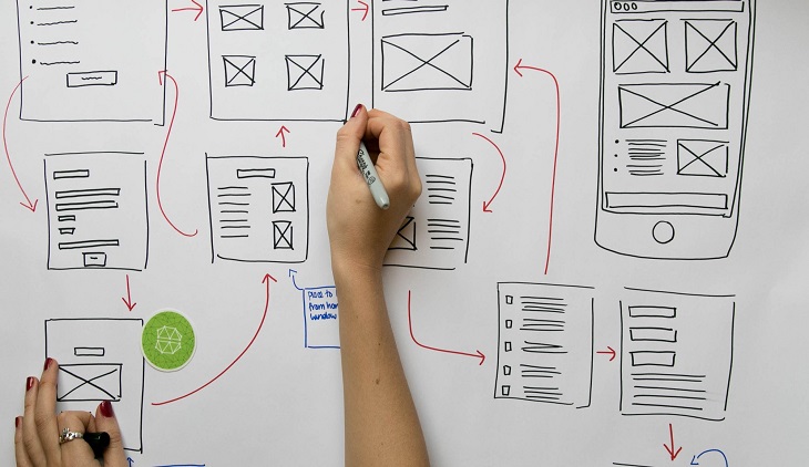
It is required to test a lot to find out what works best for the website as well as the audience, targeted and beyond. Therefore, for a UX designer a few things are every important such as:
- It is important to follow the set of rules and principle and apply the best ones accordingly
- They are also required to conduct an A/B testing method to find out how the users are responding to the elements incorporated in the web design and
- Analyze the data and result to find out what the choices the users are looking for.
Such knowledge and research will help the UX designers to make the site more intuitive, informative, and interesting. This will in turn ensure that the rates of conversions are automatically increased.
Avoid being organized loser
Therefore, the primary focus of the UX designers are on the outlook and pattern followed by the users that will help them to provide an improved user experience when they visit a website.
When the right pattern is followed in UX design then there are specific benefits enjoyed by the website such as:
- It will make the pages denser with information
- Your site and you will not be an “organized looser” and
- It will ensure that the design stimulates the eye movement of the users much like the letters ‘F’ and ‘Z’.
These are the so-called outlook patterns that UX designers these days should ensure and follow. Though named differently, both these patterns have a lot in common in terms of their characteristics. However, the Z pattern emerges as the most effective one for two distinct reasons that include:
- Its simplicity which is the topmost priority in UX design today and
- It is also far better than the F pattern when it comes to the Calls to Action.
These are the main takeaways in modern UX design which are most suitable in the Z pattern of landing page design. With such calculative and precise focus the UX design becomes more effective and result driven as more people are drawn in and are encouraged to take an action.
For the UX designer the primary thing among all UX Jobs is to form and place the call to action along the Z path to take full advantage of this specific outlook pattern. This ensures that the viewers will surely notice it when they visit a website and eventually result in more conversions.
Maintaining visual hierarchy
When it comes to designing the landing pages maintaining visual hierarchy is the primary key to good UX design. This means you will need to stay focused with a single goal while designing the landing pages. This will make the pages more effective.
- Designing the main component of the pages along with the CTA is the first important thing to do.
- Second thing to consider is the exact location to place these exactly along the natural path of the users’ eyes while viewing the page.
- Thirdly, a little bit of landing page optimization is also required to be done while placing these most important components.
All these steps will ensure that you get the highest rate of conversions. Therefore, along with the knowledge of the natural visual path the core strategy that the UX designer needs to follow is the visual hierarchy. This will help the design of the site to guide the people to the exact location and perform the desired action.
The key to good design is to ensure that the outlook pattern of the users are very well documented and used all across the web to get the maximum effects. Otherwise, in the absence of these it will be very difficult if not impossible for the UX designer to create an intentional visual flow when a user visits a site.
Factors affecting visual hierarchy
Therefore along with the visual pattern, maintaining the right visual hierarchy is the most powerful tool without a doubt to guide the users through a web page.
The first thing to consider for ensuring the best visual hierarchy in the page is where do the eyes go when you first look at your landing page. It can be a variety of things depending on the specific elements sued to designing the page such as:
- The face of the model used if any
- The price tag if it is a product selling site
- The different alluring offers made such as money back guarantee
- The form of the page and its layout
- The graphics in the page and lots of other elements in each of the pages.
Select the best items and design it in a better way to draw as much attention as it possibly can. To make sure you do that just think how you will establish a conversation with a specific person in a room that is full of people all screaming at you.
That means you will have to do away with the multiple distractions so that the page finally designed does not fail to focus the attention of the element as well as your goal of enticing the user to perform the desired action. This will ensure that you get a SEO audit report for free as well.
Generating more conversions
Lack of visual hierarchy that does not follow the proper outlook pattern will make it harder for you to generate more conversions. There are a few factors and questions to be considered to make your page the most powerful. These are:
- Will you convert when you visit your page?
- What are the chances of others understanding what the offers are?
- Do you know what to convert on even?
- What are the things that are immediately known to you?
- Is there anything else you can do to fix the overall layout to improve the visual hierarchy?
These questions when answered will enable you to take control of your designs which is ideally a combination of science and art. It is visual hierarchy, eye tracking, and human psychology that will play a significant role to cue users to look at what you want them to look at.


Pingback: CGI Flythrough
Pingback: Get The Most Out Of Sports Betting Tips - Nerdilandia
Pingback: AI and Web Development: The Unexpected Partnership That’s Changing Everything - Nerdilandia